Your workflow boost with the new Exosphere update
With the Exosphere Update (Beta), data becomes even more the basis for decision-making – ideal for energy management. Thanks to optimised usability, everything is faster: finding, navigating, and analysing.
New Analysis Module
Usability Features
To the Beta Version
Purchase Licence
Exosphere Update: Check out the video below for all of the details
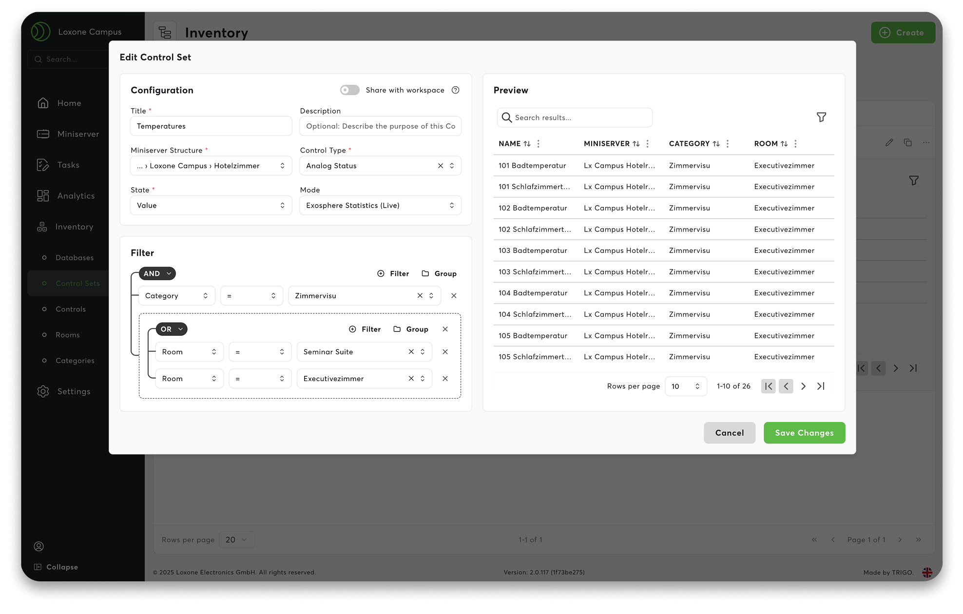
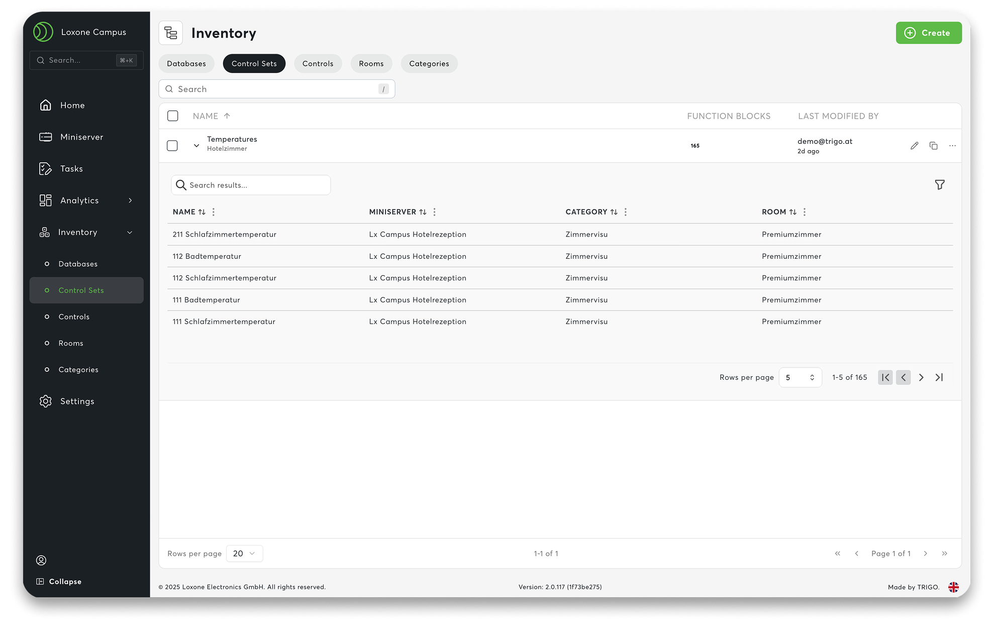
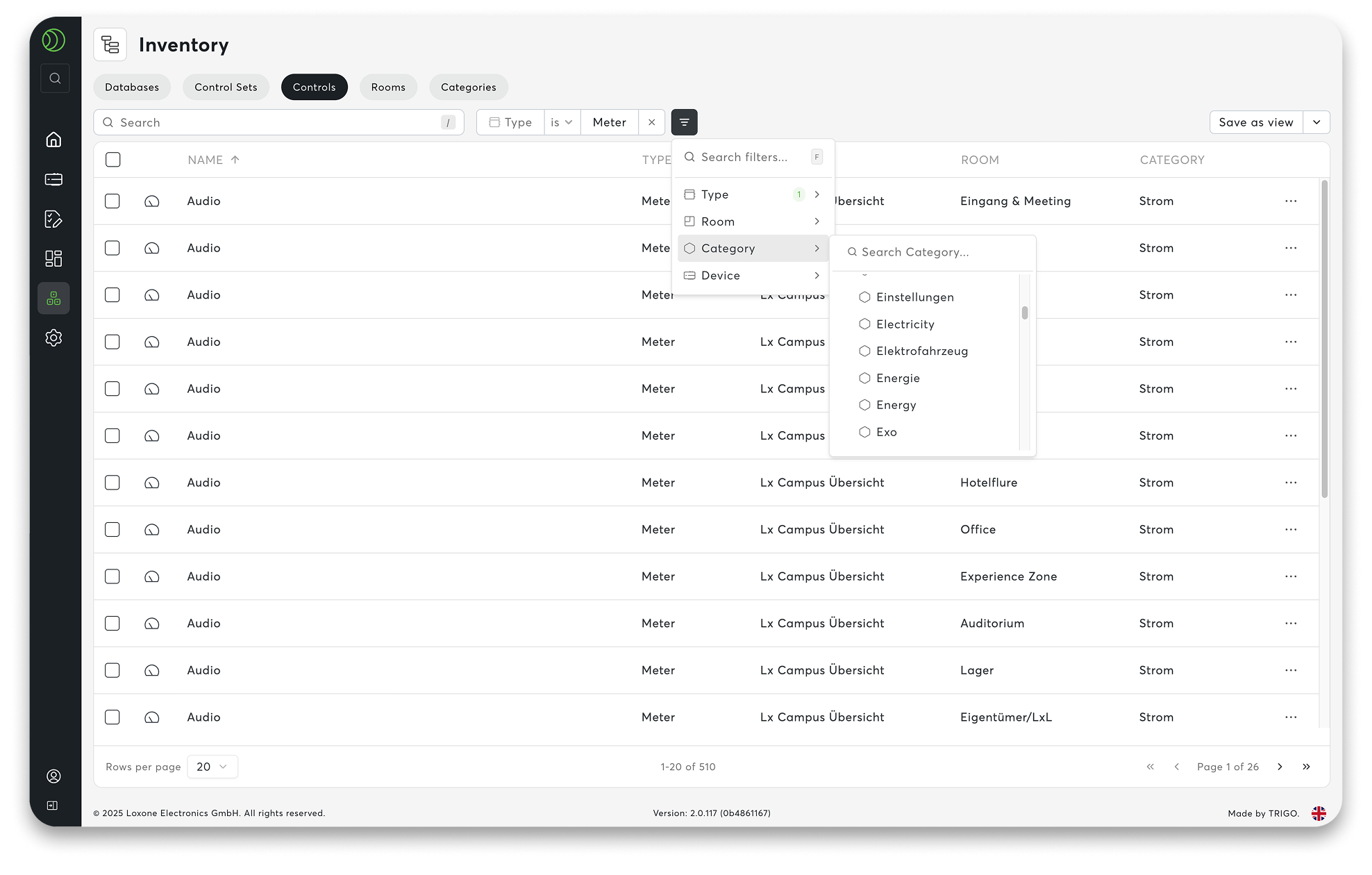
01 Control Sets – Dynamic Data Filters
Large projects are constantly changing: new employees, new locations, meter replacement – control sets keep data filters dynamic and automate them without readjustment. This makes Exosphere highly scalable, regardless of the number of data points.
Control sets ensure that your workspace remains clear. Instead of maintaining data manually, you work with dynamic filters. They automatically recognise which devices and information are relevant to whom – based on user rights. You define the logic once, and the system does the rest in the background. This means that even large workspaces, such as those in supermarkets, franchises or energy communities, remain permanently up to date.
Practical examples:
- ‘All main counters in my region’ – automatically correct for every regional manager
- ‘Temperature overview of all hotel rooms at the LOXONE Campus’ – always up to date, without any extra work
One filter. One system. And everything adapts accordingly.
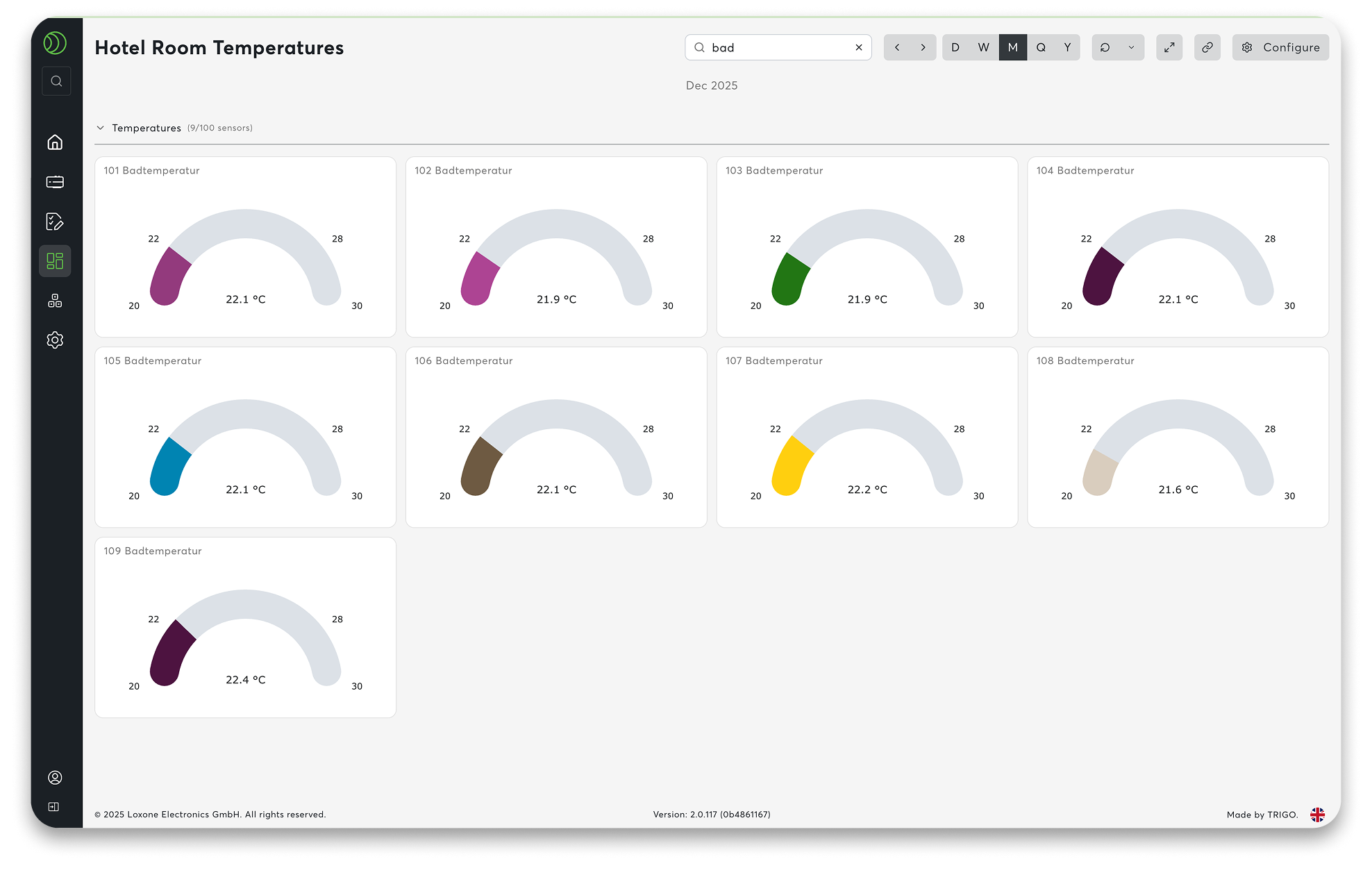
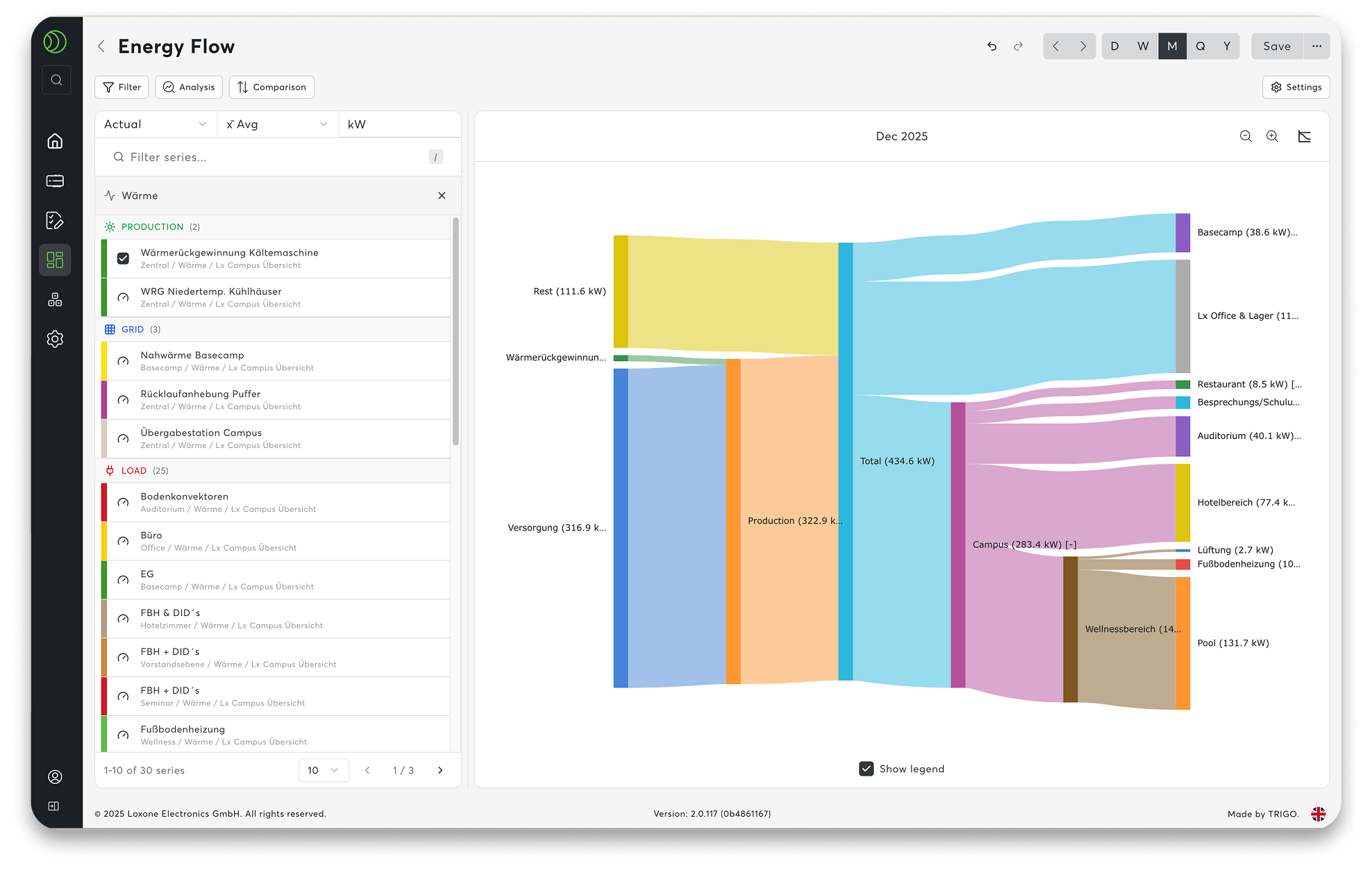
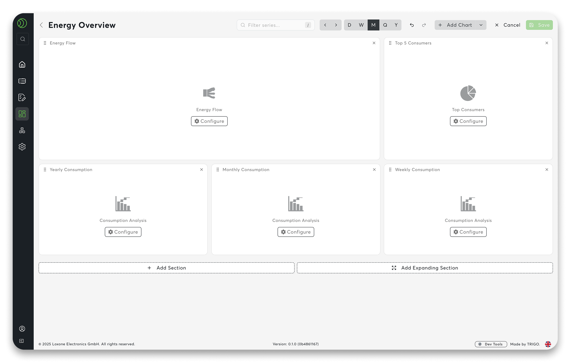
02 New Diagram & Charting System
Collecting data is one thing. Really understanding it is quite another. Clear energy monitoring across multiple locations requires transparency. The new diagram and charting system in Exosphere, including a diagram library, makes this noticeably easier.
You don’t start from scratch. Templates such as Energy Flow, Top Consumers, Consumption Analysis and many more help you to create evaluations with just a few clicks. Select a module, insert it – done. The diagrams are immediately clear and respond smoothly, even with large amounts of data. Zoom in, compare, recognise connections – completely intuitively.
In conjunction with the control sets, your charts are automatically kept up to date. When new devices are added, the evaluations simply grow with them.
What you can see at a glance:
- Top lists: Where is the most electricity or water consumed?
- Benchmarking: How do locations fare in a direct comparison?
- Target/Actual Comparisons: Target values as reference lines – deviations become immediately visible.
- Intuitive Zoom: Allows you to navigate freely through large amounts of data.
Figures become genuine bases for decision-making.
03 Command Palette
Sometimes you just want to get somewhere quickly. The Command Palette is exactly what you need for that.
Clicking on the search field in the navigation bar or using the shortcut CTRL + K (or CMD + K on a Mac) opens a central command centre. Type in what you’re looking for – a dashboard, a counter, a setting – and you’ll be there in no time. No need to navigate through menus.
The search remembers what you need frequently and delivers it for you.
The benefit in everyday life:
- Everything in the workspace can be accessed via your keyboard
- Quick access to dashboards, devices, charts, and workflows
- Fewer clicks, more focus
Navigation that feels effortless.

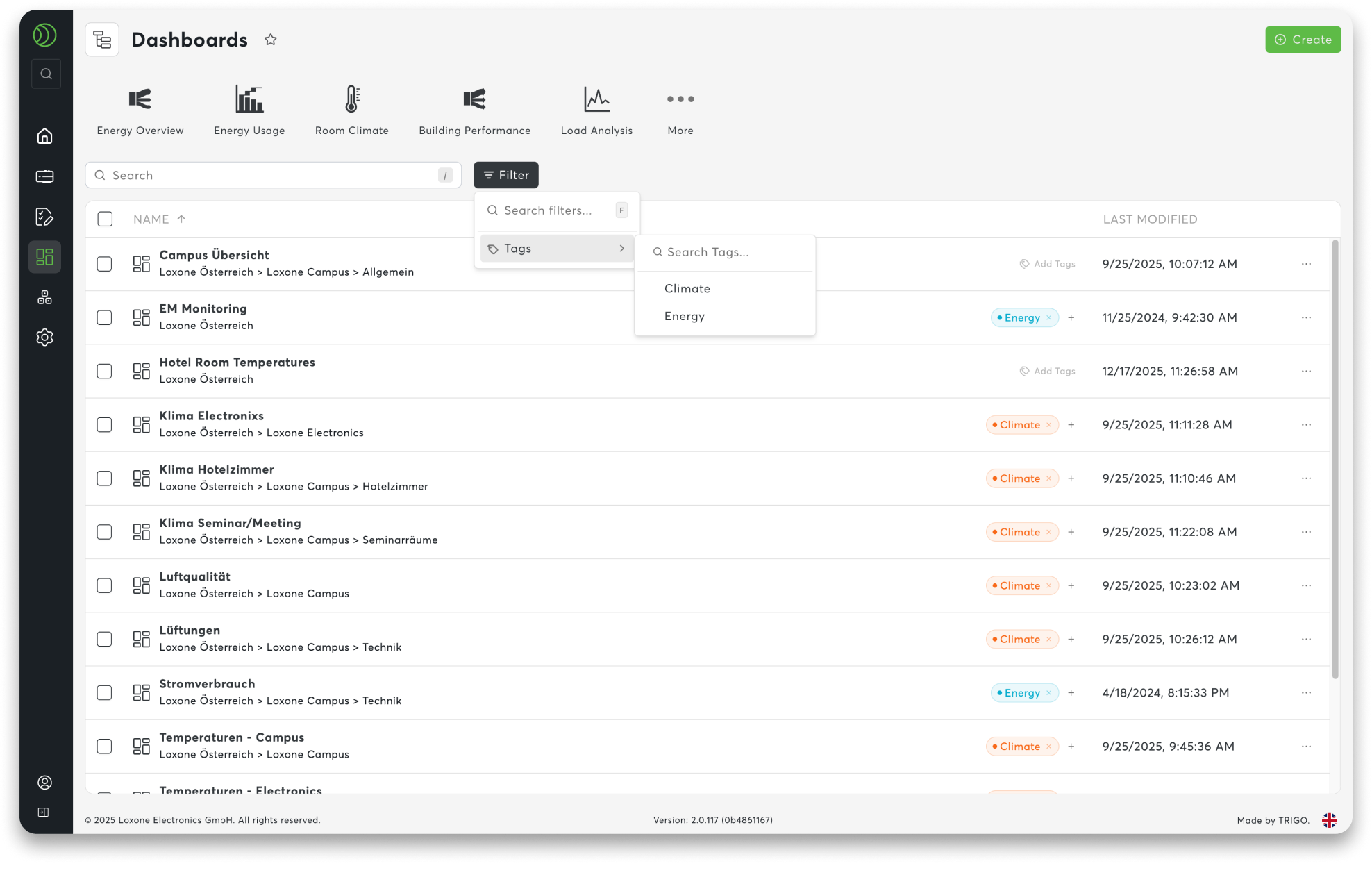
04 Tagging & Filtering System
As projects grow, organisation becomes crucial. Tags allow you to structure your workspace in a way that makes sense to you – not according to rigid names, but according to topics.
You assign keywords to content and create your own connections. Energy, heating, monitoring or whatever else is relevant to your day-to-day. This, together with persistent filters, allows you to find what you need faster – even in large projects.
This is how the system supports you:
- Structure: Assign custom tags to content
- Filter: Search by topic rather than name
- Find: Tags and command palette work together seamlessly
Your order. Your overview. And a system that grows with you.
See for yourself
Test the Beta Version
Purchase Licence