Brand Manual
LOXONE has grown significantly in recent years – technologically, organizationally, and internationally. Now we’re taking the next step and further developing our brand. For greater understanding. For greater recognition. For more people who want LOXONE.
01 Logo
01.1
Logo Safezone
To ensure maximum visibility, legibility, and brand impact, a defined clear space must always surround the Logo. This protection area prevents visual interference from other graphic elements, text, or imagery and preserves the integrity of the brand mark across all applications.
The minimum clear space is defined by the height of the logo. This distance must be maintained on all sides of the logo at all times, regardless of scale or format.
Maintaining this clear space is essential to guarantee consistent brand recognition and a strong, uncompromised visual presence.
01.2
Application Size
To ensure consistent legibility and visual integrity across all media, defined display sizes must be observed at all times. The Logo has been optimized for both print and digital applications, with specific minimum sizes established for each format.
Due to differences in resolution, viewing distance, and production methods, minimum sizes for print and digital use vary. Adhering to these specifications guarantees clarity, recognizability, and a consistent brand presence in every context.
The Logo must never be reproduced smaller than the defined minimum sizes.
*For use on digital screens the Logo width should never drop below 100px.
**Logos used in printed material must never be smaller than 2 cm / 0,78 inch.
Display*
Print**
01.3
Display Options
The Logo may only be used in the approved variations presented in this brand manual. These defined versions ensure visual consistency and maintain the integrity of the brand across all applications.
&nbps;
No alterations, rearrangements, or unauthorized modifications are permitted. The logo must not be redrawn, distorted, recolored, or combined with other elements outside of the specified formats.
Using only the approved logo variations guarantees a consistent and recognizable brand appearance in every context.
Main color combination for the Logo
Primary color use on dark Backgrounds
Primary use on light Backgrounds
Primary use on light Backgrounds
01.4
Incorrect Application
To protect the integrity and consistency of the brand, the Logo must not be altered or used in any way other than the approved applications defined in this brand manual.
Incorrect usage includes, but is not limited to, distortion, stretching, recoloring, adding effects, changing proportions, modifying typography, or placing the Logo on unsuitable backgrounds that compromise legibility.
Any misuse weakens brand recognition and diminishes the visual impact of the Logo.
Do not use green for the Logo.
The Logo is not to be placed on Images.
Do not distort the Logo in any way.
Do not use green for the logo on white.
The logo must not be rotated.
02 Typography
02.1
LOXONE Sans
LOXONE Sans is the exclusive typeface of the LOXONE brand. Designed from the ground up to reflect the Brands values, positioning, and character that define our identity.
The design of LOXONE Sans occupies a deliberate space between the technical and the humanist. Its letterforms carry the clarity and precision of a technology-driven company, while retaining the warmth that connects with the people who live and work in the spaces we help create.
As the typographic foundation of the brand, its consistent and correct use is essential to maintaining a coherent, recognisable, and trustworthy visual identity across every touchpoint.
LOXONE Sans Regular
abcdefghijklmnopqrstuvwxyz
abcdefghijklmnopqrstuvwxyz
0123456789_,.!?;:-+#=§$%&/()*
LOXONE Sans Semibold
abcdefghijklmnopqrstuvwxyz
abcdefghijklmnopqrstuvwxyz
0123456789_,.!?;:-+#=§$%&/()*
03 Smart Halos
03.1
Halo Grid
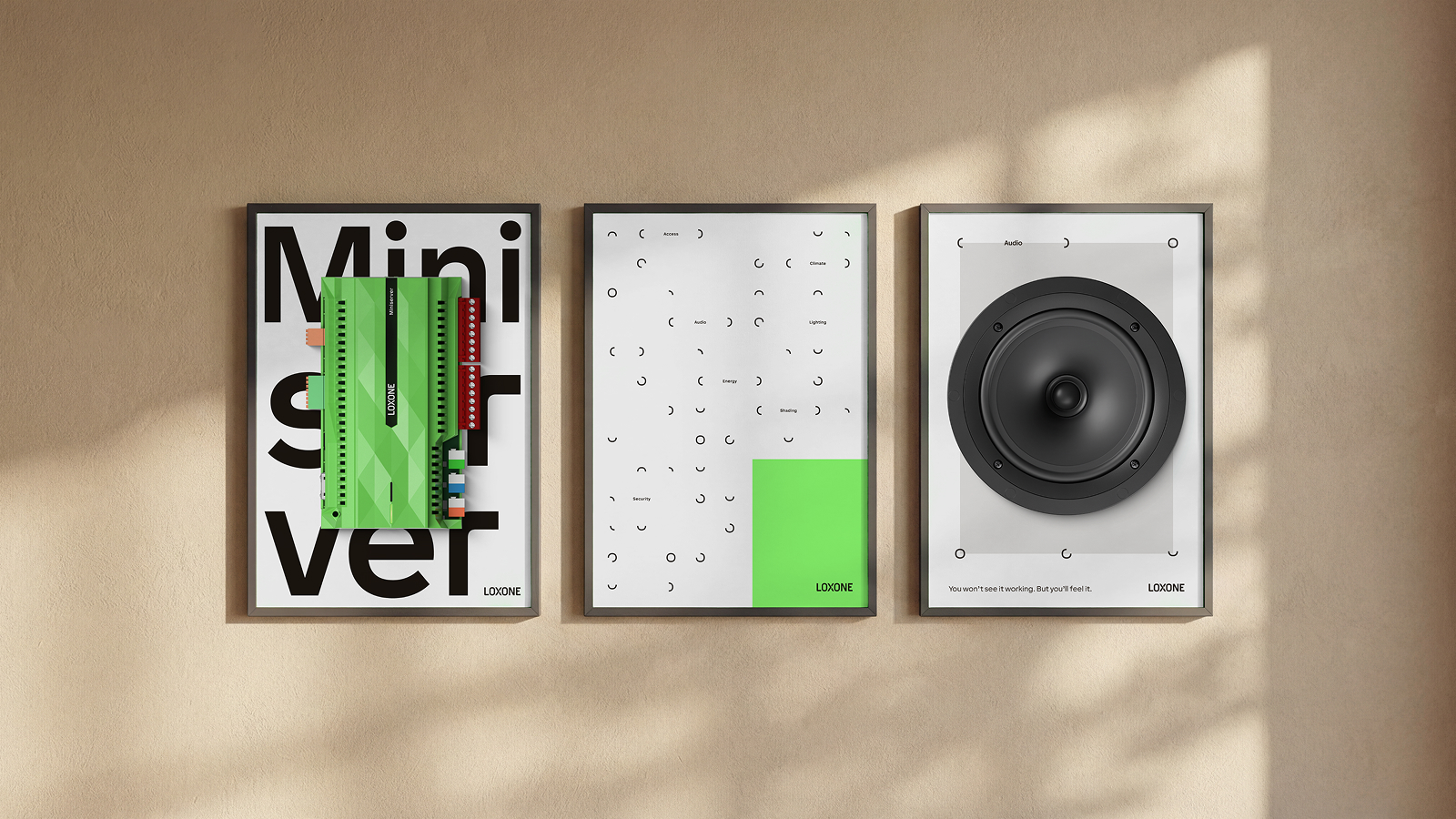
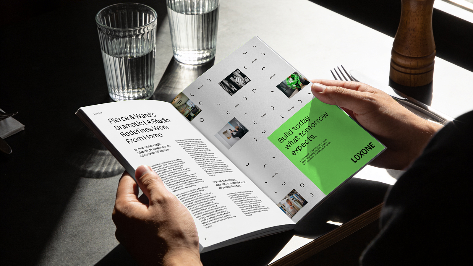
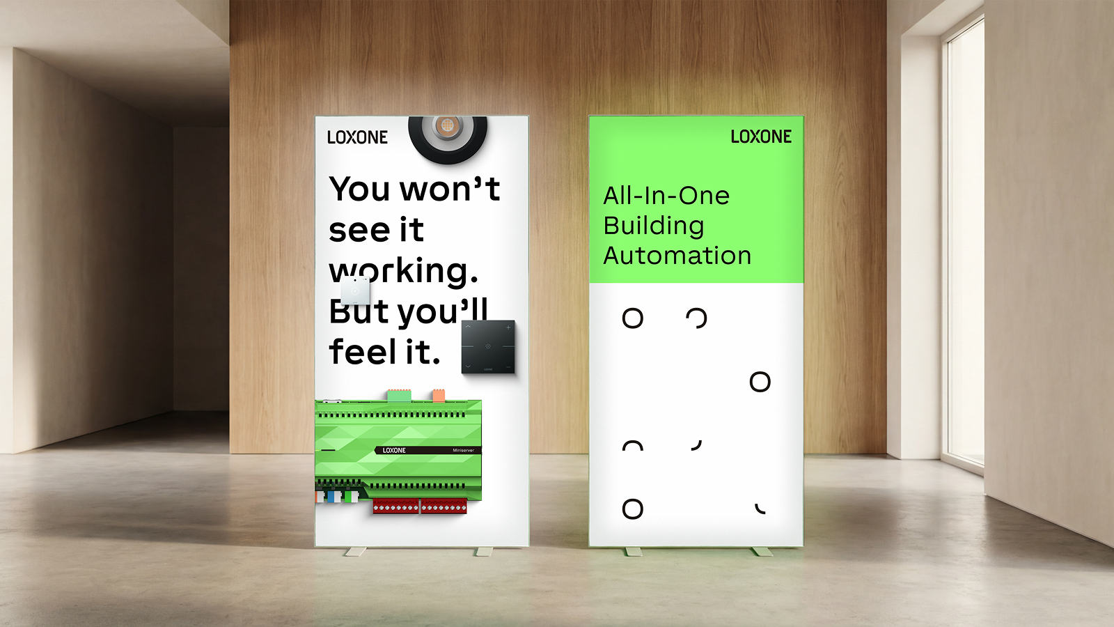
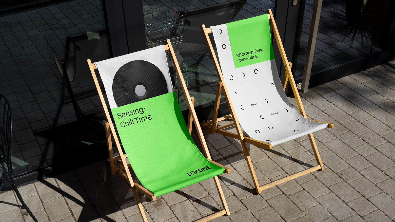
The Smart Halos are a core visual element of the LOXONE brand. They represent a distinctive and recognizable feature of the visual identity and play a central role in brand communication. Flexible in application, the Smart Halos can serve multiple functional and visual purposes across different media.
Primarily, the Halos are positioned within the defined grid system (see Chapter 03). In selected or exceptional applications, they may be used independently of the grid, provided their placement remains deliberate and visually balanced.
The correct positioning, alignment, and proportion of the Halos — as well as their associated features — are essential.

03.2
Halo Placement
The Halo Elements are always aligned with their own center axis.

03.3
Feature Placement
The features in the system are enclosed in either vertical or horizontal brackets.

04 Patterns
04.1
Pattern Design
The Halo Grid is a fundamental component of the LOXONE brand identity. It functions as a visual anchor and contributes significantly to the brand’s recognition and distinctiveness.
While the underlying grid structure defines its characteristic appearance, the format and composition remain highly flexible. The system is not limited to predefined layouts and may be adapted to suit different formats and applications.
The pattern can be applied freely, with or without Fefatures; however, each use must be carefully evaluated within its specific context. It is essential to maintain visual strength, clarity.
Pattern with Features

Pattern without Features

05 Colors
05.1
Brand Colors
The LOXONE brand color palette is defined by a clear and deliberate use of color. Connective Green serves as the primary brand color and represents the core identity of the brand. It is a distinctive and powerful element that immediately signals recognition.
Due to its strong visual impact, Connective Green is used carefully and consciously. It is applied with intention to highlight key messages, guide attention, and create meaningful accents rather than dominate compositions.
LOXONE is clean, seamless and simple. Therefor white serves as dominant Color.
LOXONE Warm Grey
2330 U
LOXONE Warm Black
Black U
LOXONE Connective Green
Ultra Green
7487 U
LOXONE White
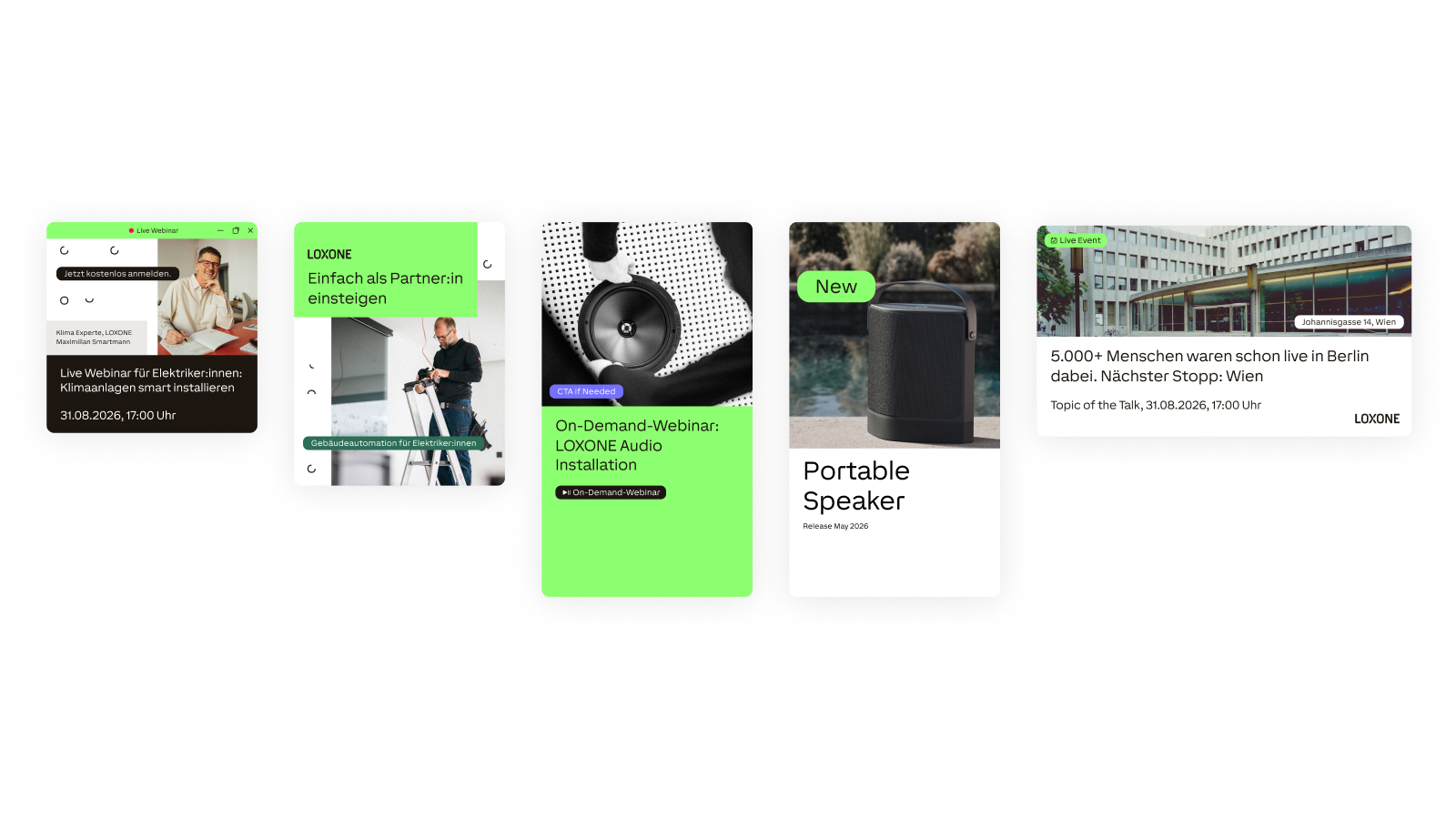
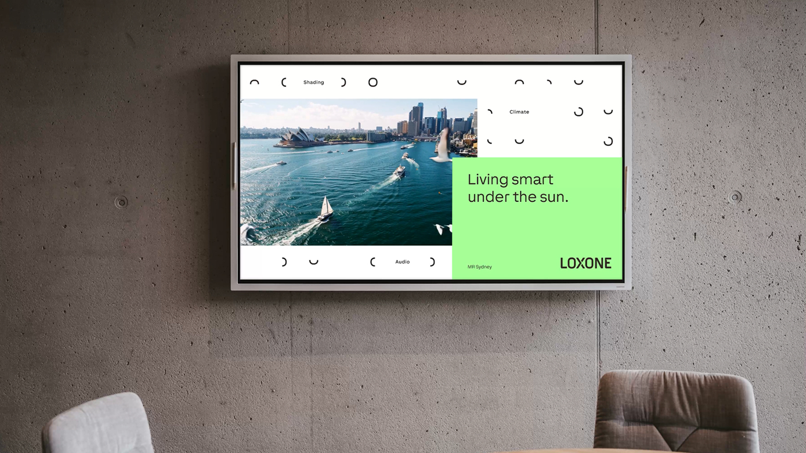
06 Application Examples
07 Image Style
